Mobile app testing checklist
A checklist of things to test on a mobile app
A tester’s mind is typically filled with lots of heuristics developed over years of learning and interacting with different applications and situations.
Developing an understanding of what breaks the flow of an application, what mistakes Developers/PMs/Designers typically make takes time and in many cases learning things hard way.
During the past couple of years, I have been heavily involved in testing mobile apps on Android and IOS for my current employer Gojek and during this time have developed a keen sense of what are some of the areas where bugs lie in mobile apps.
Wouldn’t it be nice if we have a checklist to go through to serve as a lens with which we can inspect the app from different angles to evaluate if it indeed does its job and does it well?
I got inspired to come up with this checklist after reading a blog post on the ministry of testing dojo site by the wonderful Lena Pejgan Wiberg, Would highly recommend reading this if you want to improve your testing skills on web pages.
Without any further adieu, here is the full checklist. Obviously, I think we can do better as a community and hence have created a Github repo where these would be updated as my knowledge and experiences increase. You can check it out on testing-checklists
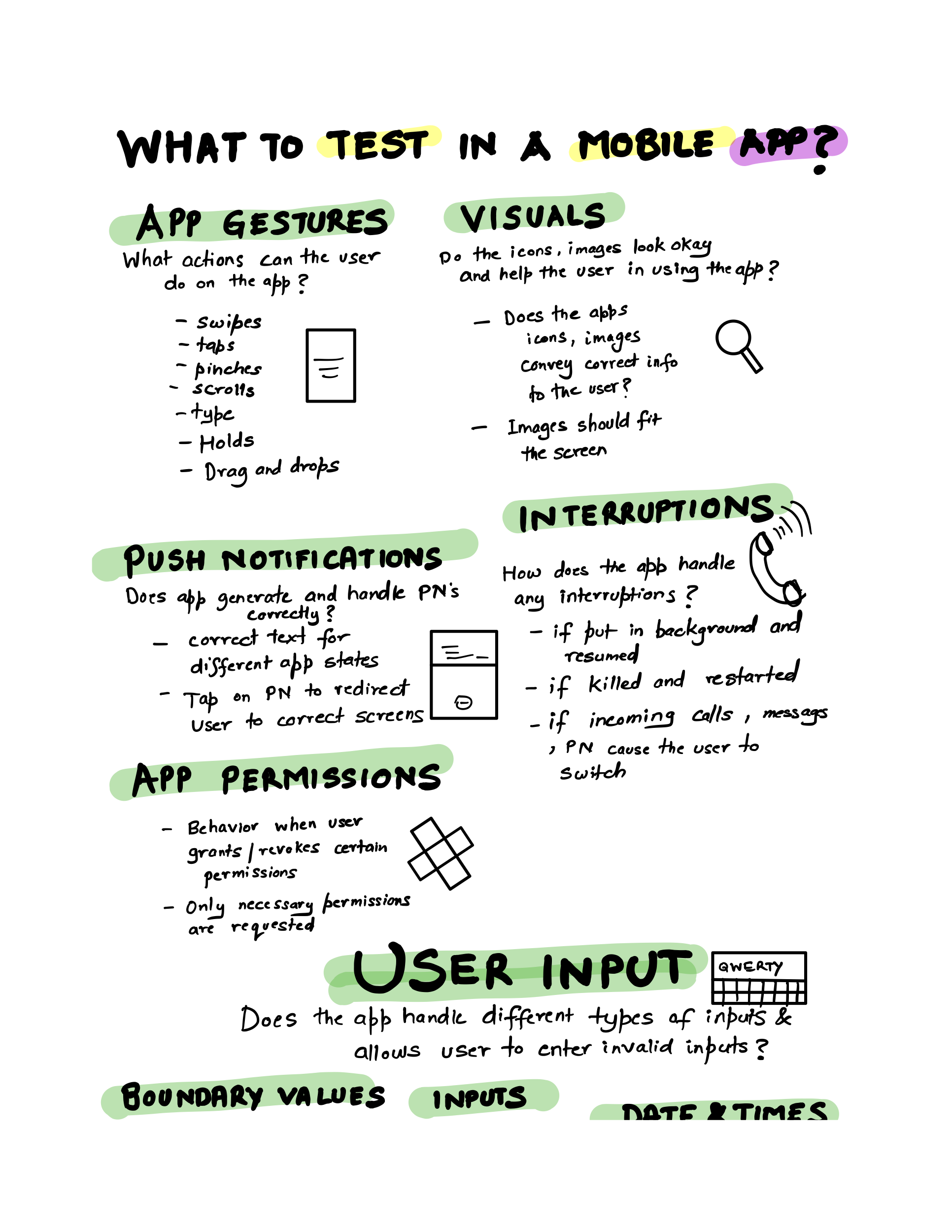
App gestures
What actions can the user do on the app?
- Swipes
- Taps
- Pinches
- Type
- Hold
- Drag and drops
Visuals
Do the icons, images look okay and help the user in using the app?
- Do the apps, icons, images convey the correct info to the user?
- Images should fit the screen
Push notifications
Does the app generate and handle push notifications correctly?
- Correct text for different app states?
- Tap on PN to redirect the user to correct screen
Interruptions
How does the app respond to any interruptions while using?
- If put in the background and resumed
- If killed and restarted
- If Incoming call, message, PN causes the user to switch context
App permissions
Does the app require the correct level of permissions and the behavior around those
- Behavior when the user grants/revokes certain permissions
- Only necessary permissions are requested
User Input
Does the app handle different types of inputs and allows the user to enter invalid inputs?
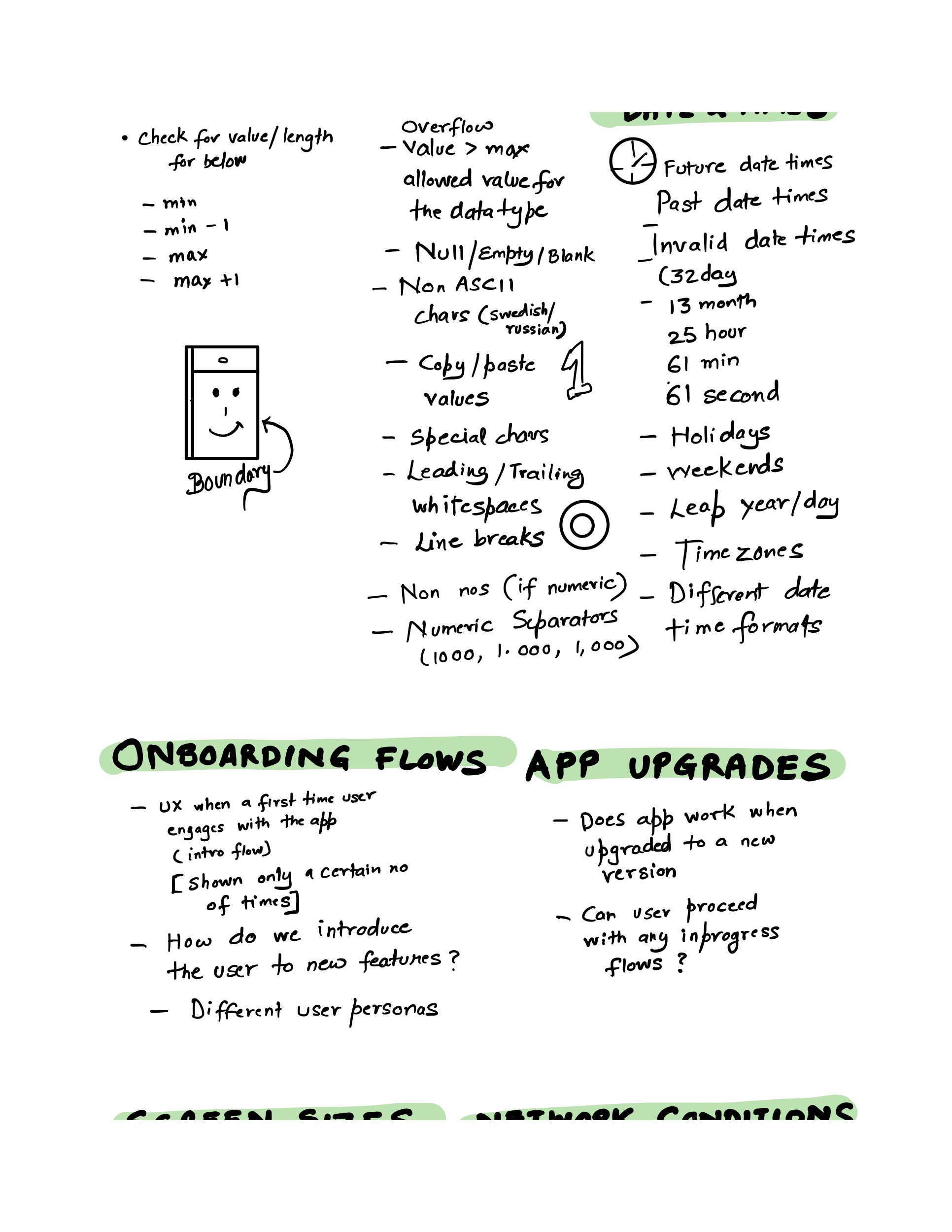
Boundary values
Check for value/length as per below:
- min
- min – 1
- max
- max + 1
Inputs
- Overflow values (Enter value > max allowed value for a given data type of the field)
- Null/Empty/Blank
- Non-ASCII characters (Swedish/Russian)
- Copy-paste values
- Special Chars (!@#$%^&*())
- Leading or trailing whitespaces
- Line breaks
- String characters (If numeric) and numeric (If String)
- Numeric separators (1000, 1.000, 1,000)
Date and Times
- Future datetimes
- Past datetimes
- Invalid datetimes (32 days, 13 months, 25 hours, 61 minutes, 61 seconds)
- Holidays
- Weekends
- Leap days
- Timezones
- Different DateTime formats
Onboarding flows
- UX when a first-time user engages with the app (Introduction flows)
- These flows should be shown only a certain no of times
- How do we introduce the user to new features in the product? Ease of comprehension
- Check different user personas
App upgrades
- Does app work when upgraded to a new version?
- Can the user proceed with any in-flight flows after app upgrades?
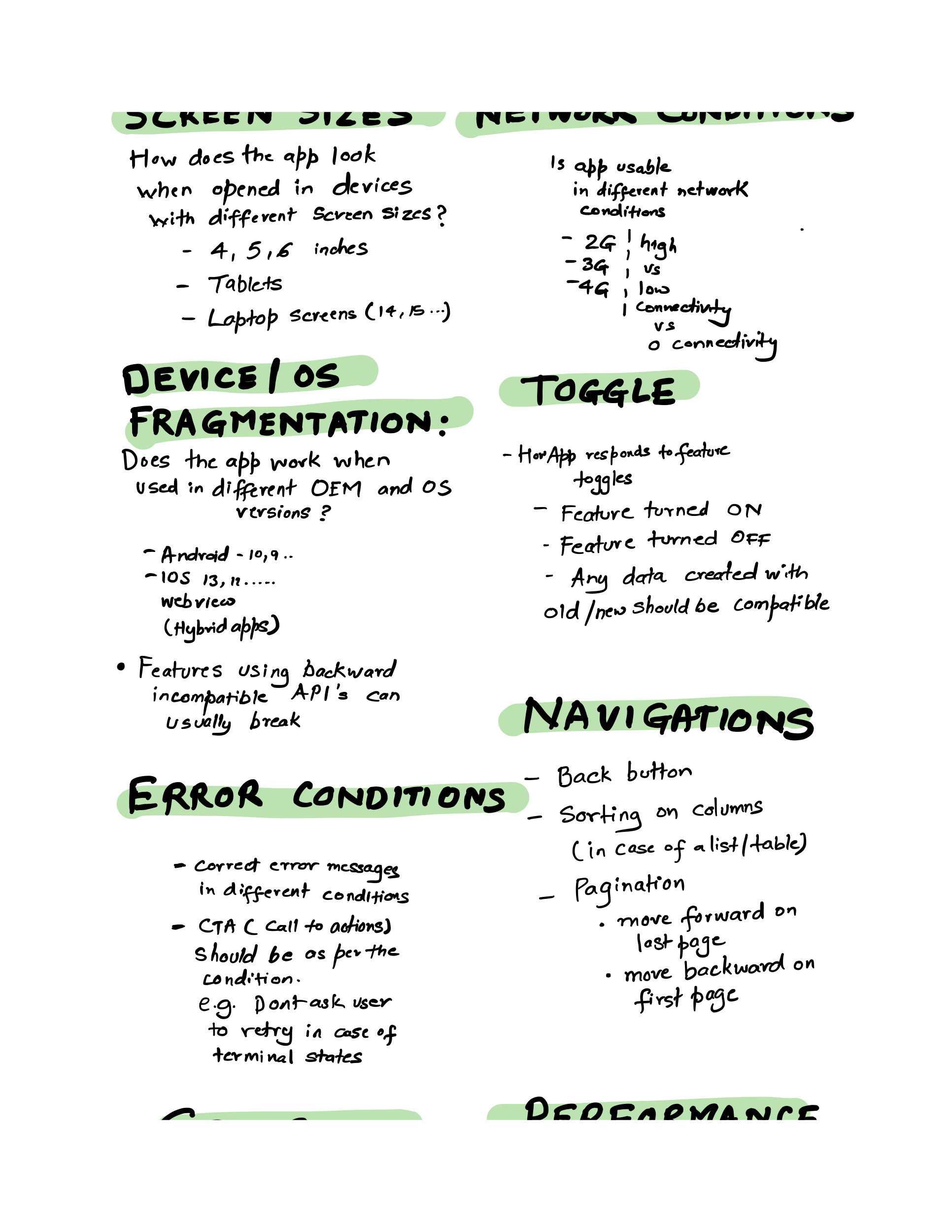
Screen sizes
- How does the app look when opened in devices with different screen sizes (4, 5, 6 inches)
- Does it look okay on a tablet?
- Does it look okay on a Desktop/Laptop screen (If applicable)
Feature Toggles
How does the app respond to future toggles
- Feature turned ON
- Feature turned OFF
- Any data created with old/new app should be compatible and should not lead to app crashes
Error conditions
- Correct error messages are displayed in different conditions
- CTA (Call to action) should be as per the application flow (e.g. Do not ask the user to retry in case of any terminal state in the app)
Navigations
- Back button
- Sorting on columns (In case of a list/table control)
- Pagination (Move forward on last or move backward on first)
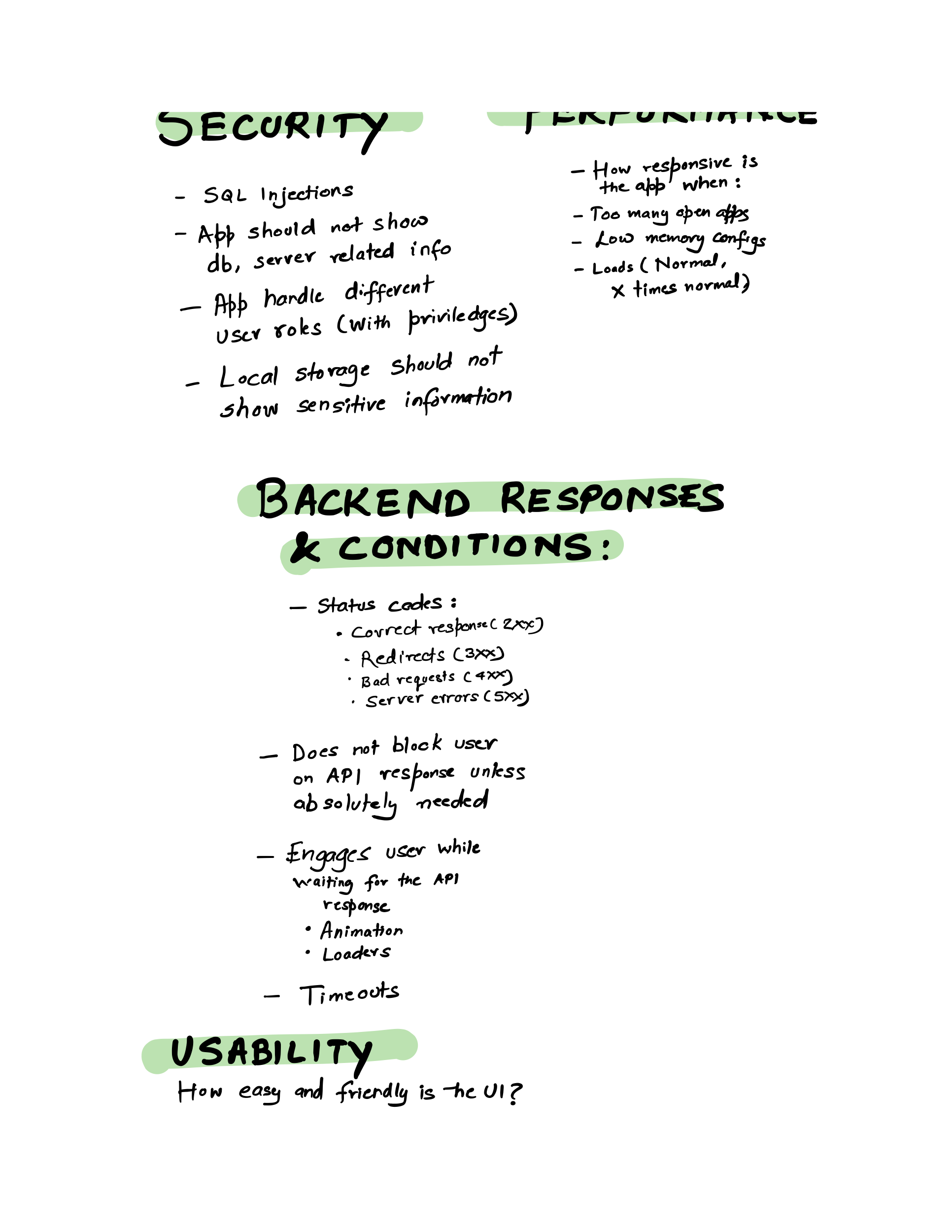
Security
- SQL Injections
- The app should never show sensitive DB, server information
- The app should handle different user roles and ensure correct information is displayed to the user with his role/privileges
- Local storage should not show sensitive information
Performance
How responsive is the app when:
- When too many apps are open
- When the app is used in low memory configs/devices
- Normal load
- X times normal load
- Extremely high load from concurrent users
Backend responses and conditions
- Status codes check
- 2XX (Success)
- 3XX (Redirects)
- 4XX (Client-side errors – Bad requests)
- 5XX (Server-side errors)
- Does the app block the user from proceeding when waiting for an API when not needed?
- Does the app engage the user while waiting for an API response (with an animation/loader)
- How the app handles when the API times out?
- How the app handles cases when the server is undergoing deployments?
Usability
How easy and friendly is the UI for use?
- Text/font is readable in different mobile sizes
- Font colors should enhance readability
- Show numeric Numpad when nos have to be entered
- Correct use of colors should be made on UI controls
- Spelling and grammar
- Localization
- Links should not be broken
- Scroll bars should be displayed when needed
- Scroll bars should be hidden when not needed
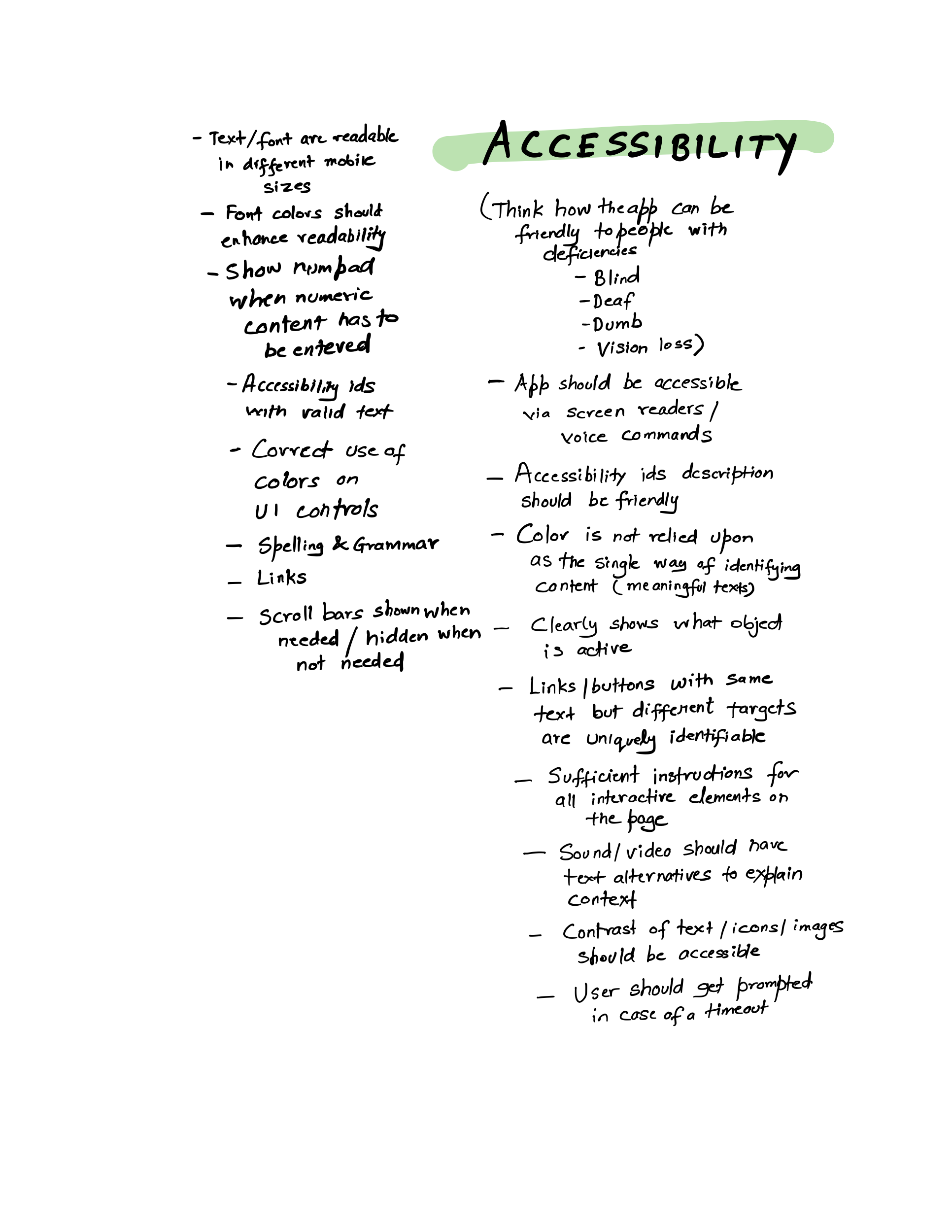
Accessibility
Think about how the app can be friendly to people with deficiencies (Blind, deaf, dumb, vision-related issues)
- The app should be accessible via screen readers/voice commands
- Accessibility ids should be available with valid text
- Color should not be relied upon as the single way of identifying content (meaningful texts)
- Clearly shows when an object on the screen is active
- Links/buttons with the same text but different targets should be uniquely identifiable
- Sufficient instructions for all interactive elements on the page
- Sound/video should have text alternatives to explain the context
- The contrast of texts, icons, images should be accessible to people with vision deficiencies
- User should get prompted if a flow gets timed out
Below is the original checklist created on notability app:
If you found this useful. Do share with a friend or colleague. Until next time Cheers!
Comments